Hey everyone,
I’m in the middle of designing a hybrid colour‑grading workspace and I’m trying to make a final decision on wall treatment. I’d really appreciate input from anyone who has balanced colour‑critical neutrality with acoustic control.
I’m currently choosing between three approaches:
What I’m attaching for reference
To make this easier to evaluate, I’ve included several images:
Questions I’m hoping to answer
I’m in the middle of designing a hybrid colour‑grading workspace and I’m trying to make a final decision on wall treatment. I’d really appreciate input from anyone who has balanced colour‑critical neutrality with acoustic control.
I’m currently choosing between three approaches:
- Covering the walls entirely with felt acoustic panels – (melange grey or dark grey — full‑wall coverage using 120 × 240 cm, 1.2 cm thick panels)
- Painting the room in a neutral Munsell value – (either N5 or N7)
- A hybrid approach – (paint the grading‑critical walls and use felt only where acoustics benefit most — guidance on ideal placement would be appreciated)
What I’m attaching for reference
To make this easier to evaluate, I’ve included several images:
- Side‑by‑side comparisons of the felt samples (melange grey, dark grey, etc.) next to an X‑Rite ColorChecker grey patch so you can see how neutral they actually are under controlled lighting. Also reference link to Merange Grey & Dark Grey both colours and texture found here: https://mute.ae/collections/wall/products/plain-panel-1?variant=50204103475360)
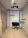
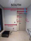
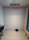
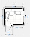
- Photos of the room with dimensions so you can understand the scale and wall geometry.
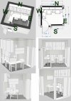
- A floor plan with the sit / stand desk (1x L shape on left of north wall fro colour grading / editing & 1x standard on right of north wall for my partner), monitors, cabinets, and client TV rendered in to show exactly where everything will be placed and which walls are grading‑critical.
Questions I’m hoping to answer
- Are melange grey or dark grey (or others shown) felt panels neutral enough for a grading environment, or does the texture/mottling risk influencing colour perception?
- If texture is a problem, is it safer to stick with paint (N5 or N7)?
- For a hybrid approach, which walls should be painted and which should receive felt? My partner is on video calls sometimes so that why I thought of doing the monitor facing wall also).
- If I go with paint, would a combination like N5 on the north wall (the grading‑critical wall) and N7 on the surrounding walls make sense, or should everything be a single value?
- The desk sits in the north–west corner of the room.
- Desk depth is 70 cm, and it’s pushed directly against the wall — so both monitors sit very close to the wall surface.
- The grading monitor will sit in the corner between the north and west walls.
- The ultrawide monitor will sit directly against the north wall.
- I’ll have cabinets mounted above the desk on the north wall, so whatever finish I choose needs to integrate visually with cabinetry.
- On the west wall, above the desk, I’ll have a client‑facing TV on a pull‑out arm so clients can adjust their viewing angle. I will have a store away couch for them to sit agains the south wall.
- On the south wall behind me, I’m planning vertical wooden slats with felt acoustic backing for rear‑wall absorption/diffusion.
- The room is a jack of all trades; a colour gadding edit space for me and an office area form my partner, whilst also being a guest room with a makeshift bed if guests come to town)